Monday, September 3, 2012

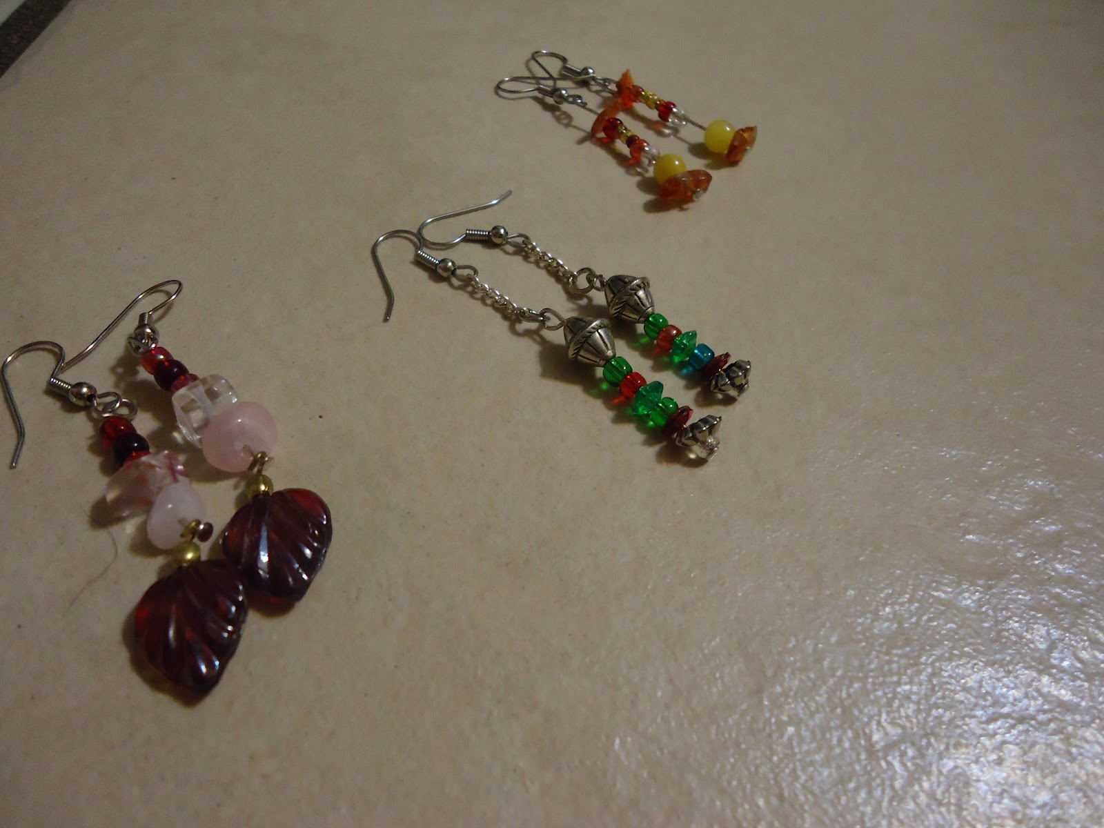
Seasonal Earrings


Art. So you all know that I make art, but did you know that I make jewelry? Of corse you didn't, I've never shown any before!

So these three are Valentine's Day, Christmas, and Thanksgiving/Fall earrings I made for my mom. 
What do you think?

Sunday, August 12, 2012

One trick pony


New character ho!

Meet 1-Trick Pony. He is what's called a chao. Chao started off as little friends in the Sonic Adventures theme. Since then chao have hained massive popularity over the internet and have expanded far past what they originally were.

1-Trick Pony is a very interesting character. He is part one of three of the personality of Infi. 1-Trick represents Infi's determination, musical tallent and stubbornness. 2-Trick Pony represents his kindness, and hospitality. 3-Trick Pony represents Infi's strength and temper.
At different points, each bit of the personality may be dominant at one time. When that happens, the number in the right eye changes to one, two, three, or an infinity symbol depending on which aspect is present.

Complicated enough yet?
There is, in fact, more however I will spare you his long and confusing backstory. All you need to know is that he didn't always have these aspects all split up.

Sunday, July 29, 2012

Dragon Wall Scroll


So sometimes one has to go back to one's roots. You see, when I was a much younger artist I had this odd fascination for dragons. Therefore, the only thing I would draw was dragons. Dragons, dragons, dragons. As you can imagine, I got pretty good at them... but then I realized I was lacking in all other fields, so I backed off.
Once and a while, though, I do go back to dragons. I like to see how much I've improved.

Monday, July 23, 2012

Belize Mission Trip 2012

Well, I'm back. It's been a while, hasn't it? I bet you're all wondering "Hey, were's The Teenage Artist and why hasn't she posted art in a while?"
To put it frankly, I've been in Belize. Why? Well...

Monday, June 18, 2012

Friday, June 1, 2012

Lie AMV


Here's another AMV for all of you!
This time it's with Lyra, Leo, and Kenneth. Leo and Kenneth are both in love with her, but how can Lyra choose?

Monday, May 28, 2012

Thursday, May 24, 2012


Stop-motion animation! Ah-HAA! You knew I did 2D animation with my DSi, but did you know I do stop-motion? Well, I do - and this is my first big project. This is Wooden Poser starting Me, My dad, and Sawdust the Pose Mannequin. Three whole days in the making. FEAR MY SKILLS!!

Wednesday, May 23, 2012

Notes and Scrawlings

A day in the life...


My best friend wrote me a poem today.
To be more specific, she drew a picture of a character of mine and set it to a poem. The character is a little mutt-dog laying on the ground with his chin on his arm - looking over his shoulder. The poem - as my friend told me - was actually a school assignment. "It's about you" She said.

Backing up, this friend is named Rudy. She's my best friend of all time. We're both artists and so we'll write/draw things for each other as gifts.

The poem is as follows:

Un lobo con color tan claro,
Que apesar de su aspecto
nunca esta desolado.

Yo conosco a este lobo inocente y alegre
que nunca es cruel, nunca es rebelde.
Que aunque todos esten encontra de este
el nunca deja, de ser inocente.

Durmiendo despierto,
anda rondando,
de arriba para abalo,
se la pasa imaginando.

Siempre lo veo
a este lobo andando
por su mundo rodando
e imaginando.


That all roughly translates out to:

A purely colored wolf
that appears with the aspect
that they are never desolate

I know this wolf - cheerful and innocent
never cruel, never rebellious.
That though everything may be against it
it never fails to be innocent.

Sleeping peacefully,
it is free,
to open its mind,
to places of imagination.

I always see it,
see this peaceful wolf
in it's created world
of pure imagination.


- TheTeenageArtist

Sunday, April 29, 2012

Will Draw 4 Food


Now, while it may be considered cliché to call oneself a 'starving artist', there's a good reason for that term. While I, as a teenager surrounded by the food my parants bought, have no experience or even the right to call myself a 'starving artist', I thought I'd play up the term a bit.

The teenager still living in a house stocked full of food does not count. She has, however, begun to understand what an artist goes through to make money. Even if said money is fictional currency on a kids website.

Enough rambling, on to the picture. 
As something quick that I whipped up in 30 minutes, this one's really not bad at all. I was going for maximum cuteness, so if you die of cuteness OD... sorry.
The character seen here is my 'fursona'. A fursona is basically a person would they be an animal. It is the basics of someone's personality that has been given the physical form of any animal. The markings or accessories on a fursona help better symbolize the personality the fursona is trying to represent.
The shading is good, if a tad messy, the lines are simple and effective, and the coloring is solid. There is, however, a major anatomy flaw. The back legs and flank are far too small and squished to be realistic, although the paws are stylistically blank, the left one is a tad too large.
Other than that, though, I really like this 1/2 hour peace of art.

Tuesday, April 24, 2012

Tuesday, April 17, 2012


All right! More on my Lyra story. I've officially named it now and it's The Selling of Dreams.
The Selling of Dreams will be a full length novel, and the chapters will be posted here as they're made - Charles Dickens style. 

What, you may wonder, is going on here. Well, I can't tell you. It's a teaser to get you excited about the story. Be excited. 
All I can tell you is that the character on the left is Lyra, and the one on the right is Leo.


Onto the official art-bashing!
... What can I say, I'm really proud of this one. It looks like I'm going to have to be nitpicky on this one. Well, Leo's shoulder is sort of lopsided... one of his claws is awkward... the back of Lyra's head looks weird...
Aaand that's all I can really pull out of this one.
I can't take credit for the rain, though. That was a stock image that I edited. 

I need you guys on this one, I'm not really able to critique this one on my own.

Friday, April 6, 2012

Bad words? No Problem!

Don't you hate it when you're sitting and listening to a song, and in the middle of you enjoying yourself someone drops an f-bomb. It jolts you out of your zone, puts a frown on your face, and prevents you from enjoying the rest of the song. Moment ruined.
If not... never mind.
If so, then we both know the feeling of being upset like that.

Well, I've decided to fix that. I want to go through and find all those songs I like but I can't listen to because there's not a clean version in sight. I just downloaded the free audio editor Audacity and began my quest.

Starting with You're Gonna Go Far Kid:


See if you can find where I edited out the f-word. If you can, you win a free internet.

What? This doesn't fit in my blog? It's not art?
...I'm stretching my audio editing skills. It counts!

- The Teenage Artist

Friday, March 16, 2012

Lyra


Transition is natural in each and every phase of life. It is a central part of any facet of absolutely anything. This is also far too true when it comes to art. As an artist grows, so does her imagination. As that changes, so changes her perception of what makes up a good character. As she matures, so do her creations.
Change happens, and when it does sometimes things need to be cut out. When something is holding you back, you should get rid of it. If something limits you, dump it. Maybe your favorite brand of pensil erases poorly. Maybe that old tablet of yours is so used it doesn't even synch with your stylus... Maybe the character you've had for four years is keeping you from creating more like you really want to.
Maybe I should start talking like a normal human being.

Four years ago, I created my two first characters: Nevermore and Suoegni. Twin wolf sisters with polar oposite personalities. I loved them at first and used them in most things. As time went on, I added to their story, made new characters and added onto them. I loved them all, and would use them in my art, animations, stories and most everything. However, as I grew and matured I started noticing things I hadn't before. I started to realize how shallow most of them were and how the characters I loved the most were the ones I had created the most recently. As I started to think more, I started to realize even more how basic they were. I realized that they were limiting me. I realized that I was spending so much time on those other characters, that I had no time for anything new. 
So I got rid of them. 
I got rid of the characters that I had spent two to four years of my life on.

I am now so free to do absolutely anything, I don't know how to describe it. I am creating worlds now. Literally creating worlds in my head. 

Lyra is part of this new creation. She's my new main character, and I love her. She's an anthro feline. She owns an incense shop called Rainbow Philosophy. She will make and sell all her own unique incenses. As a hobby, she makes small pyrotechnics. All of this, however, is just a front for a darker business. At night, she opens up the back room of her shop as a secret drug house where people will go to safely buy and smoke different drugs away from the eye of the law. To keep all of this under wraps, Lyra works as the hitman for a rich family. If there's anyone Mr. Pennygold works with who happens to know too much, Lyra is the one who makes sure they stay silent. Working with hallucination-inducing-incense of her own make, Lyra can be a very deadly force to deal with. The incense stick behind her ear is a counter-incense so that she does not fall prey to her own hallucinations. 
Even though she is proficient at this, however, all she would ever want is to run her two businesses in peace - without interference from the law or the Pennygolds. 

Cool, no?

Sunday, March 4, 2012

The Teenage Artist - Steampunk for Dummies


Ever really wonder what steampunk was? Has no one really been able to explain it to you? Well... neither can I. This is about as much as I can get out in 2 1/2 minutes, so that's all that you're going to be able to get.


YouTube: http://www.youtube.com/user/TheMoonlitHowl?feature=mhee

Flipnote: http://flipnote.hatena.com/5852D3501E2E4D53@DSi/

DeviatART: http://chirinwarrior.deviantart.com/


- The Teenage Artist

Puerta de Esperanza

Puerta de Esperanza, or The Door of (to) Hope is the name of the street children devision of our ministry. What is that?
Well, I am a Kid Missionary in La Ceiba, Honduras. This aspect of our mission deals with children who are forced (for various reasons) to live or spend most of their time on the dirty streets - living on their own and in horrid, starving, filthy conditions.


Theme:
As the official logo for a branch of missions, it is simple, clear, and effective. It also works very well as the stamp it was turned into.

Content:
A dove flying through an open doorway. I feel as if that is an effective logo to fit the title.

Originality:
Personally, I haven't quite seen this before in a logo. Again, I feel it is very effective in symbolizing the mission and it gives a clear image to go off of.

Execution:
While there are some minor cleanness issues at the chest and at the back of the neck, they are invisible in stamp form. The size of the lines fit very well in the seal as well

Overall:
A very well done piece. Simple, but effective

Your turn again! This is my first attempt at a logo, so I want some really good criticism here.
Also, I'll not be ranking the topics anymore, I feel that it was too constricting.

Saturday, February 25, 2012

A Burial of Roses


Tremble in fear of my traditional art! You are now impressed. Admit it.

This, my friends, has been one of the most fun pieces of art I think I have ever worked on. I have had this idea floating around in my brain for quite a while, and I was quite happy to get it out on paper. The style of shading you see here is called cell shading. You most commonly see this method in both Eastern and Western comics. The thick, bold shadows can add a very dramatic air to the piece, but they can also be difficult to handle. If not done properly, the shadows will merge with the outlines of the image and make it look far too blotchy. The best way to avoid that is to leave a small white gap unshaded so that the original lines are still visible.

Fun fact: The eyes and mouth are shiny because I used a red gell pen instead of a felt tip one.


Theme:
A Burial of Roses depicts the dramatic death of a wolf, using the rose petals symbolically in place of blood. This gives a much more ironically sinister air to the picture - as roses are usually regarded as something lovely and beautiful.
4/5


Content:
The character used here, Cyriis, is a very monochrome character to begin with. Therefore, the perfect selection for this mainly black-and-white piece.
5/5

Originality:
While dark characters are not by any means original, and cliché villains are far too numerous, I find that this one depicts not only a dramatic death contrasted by beautiful roses, but also a sense of desperation.The shading is dark and dramatic, and the expression is sorrowful, but the roses (again) contrast very well with such a saddening image.
5/5


Execution:
Anatomy and proportions are great, a slight perspective is well executed, the shading is near-perfect, and the red roses stand out against the blacks and whites. 
The few flaws in the shading do not inhibit the drawing, and are not overly noticeable. The two small places being at the arm and the fur near the shoulder which seems to be slightly disconnected.
4.5/5


Overall: 4.5/5


Your turn! 
I really, really want your opinion on this! It was amazingly fun to do, and I think very highly of it so I therefore want to see how it can be improved. Thank you!

Tuesday, February 14, 2012

Sculpting With Gears

Sculpting! New Mediums! Tape! Gears! Buttons! Owl! What is that thing?

As one of my most recently attempted mediums, my hand is weakest at clay. If you're not an artist, here's a translation: I'm new at clay.
That said, it would be pretty obvious that I'd be bad at it, right? Well, it seems that - thus far - this little guy is the only sculpture I've made that has survived. I tend to have issues with blending two peces - but we'll get to that later... for now, the intro.
INTRO:
The critter you see before you is what I have dubbed a Metail. Metail are unique clay-and-metal creations, each with their own flair and purpose. While every one of them is unique they all have the same chain-like tail - hence the name of the species. Each individual is named for it's own purpose. This one specifically is Host. Host is a kind and welcoming Metail. He loves throwing parties and seing people happy. Host can most frequently be seen chatting away in the center of large groups of friends.

Theme-
With a mix of critter, alien, steampunk, and something else, the 'Metail' species created here is a cute little mix of metallic and organic.
5/5

Content-
Shark teeth and a gear on the shoulders, leaves for ears, a "belly-button", and gears for eyes, all mixed nicely in a simple animal-esque form solidly into a unique creature of pure imagination.
5/5

Originality-
While there have certainly been many clay "critters", the pseudo-mechanical touch really adds originality.
5/5

Execution- 
While most of the rest of the sculpture is wonderful, here is where the fault lies. While it is noted that I am quite new at sculpting, there is still much more attention to detail that could have been payed. The figure of Host is cute, but notably warped at places - mainly the feet. The symmetry of said feet would have added more unity to the piece. 
While it may not be clear in the photo, the clay is unpainted - therefore dirty. The white baking clay picks up much dirt and smudges in the sculpting process and can leave quite a muddled look. That is what happened here.
3/5

Total-
4/5 - Great


Your turn! Critique, yell, bash, rant all you want - that's what this blog is for!

- The Teenage Artist